
In 2025, users expect websites to look flawless on any screen — whether it’s a smartphone, tablet, laptop, or even a smartwatch. This demand for seamless accessibility makes responsive web design not just important, but essential for every modern business.
📱 What Is Responsive Design?
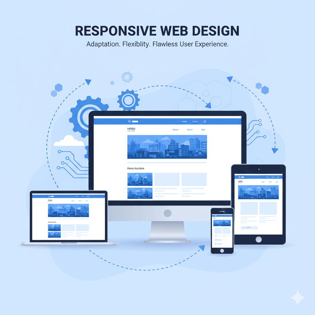
Responsive design ensures that a website automatically adjusts its layout, images, and content based on the user’s device. It creates a consistent and smooth browsing experience — no zooming, pinching, or horizontal scrolling required.
💡 Why Responsive Design Matters
- Mobile Traffic Rules the Internet: Over 75% of web traffic comes from mobile devices in 2025. A non-responsive website drives users away instantly.
- Better SEO Rankings: Google prioritizes mobile-friendly websites in search results, meaning responsiveness directly impacts visibility.
- Enhanced User Experience: Visitors stay longer and engage more when navigation feels natural and content is easy to read.
- Cost Efficiency: Maintaining one adaptive website is cheaper than creating separate versions for mobile and desktop.
- Increased Conversion Rates: A smooth experience builds trust and encourages purchases or sign-ups.
🧩 Core Principles of Responsive Design
- Fluid Grids: Layouts that resize proportionally instead of fixed pixels.
- Flexible Images: Images that scale and crop correctly on every screen.
- Media Queries: CSS rules that detect screen size and adjust content dynamically.
- Touch-Friendly Elements: Buttons and menus optimized for finger taps, not just clicks.
🚀 Tools That Make It Easy
Frameworks like Bootstrap 5, Tailwind CSS, and Figma Auto Layout have made building responsive sites faster and more intuitive. Developers can now preview designs across devices instantly.
💬 Final Thoughts
Responsive design is no longer a trend — it’s a standard. In a world where your audience connects from dozens of screen sizes, a non-responsive website isn’t just outdated — it’s invisible.